
Reviving a room with a fresh coat of paint is a timeless method to rejuvenate your living space. However, not all paint colors are created equal, and some can inadvertently dull the ambiance you’re aiming to enhance. Let’s explore expert advice on selecting paint colors to breathe new life into your home while avoiding those that can diminish its vibrancy.
The Impact of Warm Earth Tones:
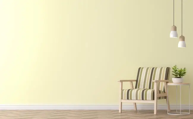
Warm earth tones, though seemingly inviting, can sometimes lead to lackluster results. According to Jerith Bailey, an esteemed interior designer, and general contractor at Mahogany Builders, hues like beige and brown can inadvertently dampen the brightness of a room. Instead, Bailey suggests opting for neutral shades like gray, such as Accessible Beige by Sherwin-Williams, for a refreshing and immaculate ambiance.

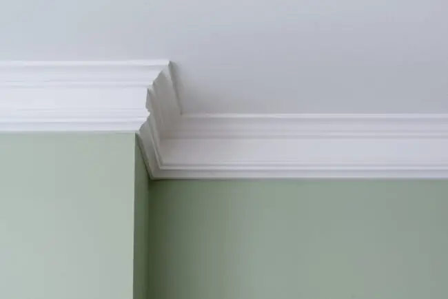
The Importance of White Trim:
Trim paint plays a pivotal role in achieving a crisp and clean appearance. Bailey emphasizes the significance of choosing a bright white hue for trim to complement the walls effectively. Classic options like Chantilly Lace or Benjamin Moore’s Decorator’s White are recommended. However, it’s crucial to avoid pairing pure white trim with warm earthy tones, as this can detract from the desired effect.
Choosing Paints That Conceal Imperfections:
Consideration of a paint’s Light Reflectance Value (LRV) is essential for both cleanliness and brightness. Bailey advises against colors with low LRV, like deep marines, which may conceal dirt but could compromise the room’s overall brightness. Opting for shades with medium LRV, such as an eggshell finish, strikes a balance between cleanliness and luminosity.
Navigating the Dusty Pink Dilemma:
While dusty pink may evoke a romantic ambiance, selecting the wrong shade can result in lackluster walls. Andra DelMonico, chief interior designer for Trendey, suggests opting for lighter shades of pink, such as Rose Sorbet by Behr, to avoid this issue. DelMonico’s insight highlights the importance of choosing paint colors that maintain the desired vibrancy of a room.
The Pitfalls of Yellowish White:
Although white is a popular choice for its versatility, yellow-dominant hues can inadvertently make walls appear dirty. Angela Hall, a certified home staging specialist, warns against pairing yellowish white with bright, cool white tones. Instead, she recommends neutral whites with cool undertones, such as Simply White by Benjamin Moore, to achieve a fresh and clean look.
Expanding Your Color Palette:
In addition to avoiding certain hues, expanding your color palette can invigorate your space. Experimenting with bold accents or unexpected color combinations can breathe new life into a room. Bailey suggests considering complementary colors for accent walls or statement pieces to add depth and interest without compromising cleanliness.
The Impact of Lighting:
It’s essential to consider how lighting affects paint colors in your space. Natural light can enhance certain hues while artificial light may alter their appearance. DelMonico advises testing paint samples in different lighting conditions to ensure your chosen colors achieve the desired effect throughout the day.
Conclusion:
In conclusion, revitalizing your home with a fresh coat of paint is a transformative endeavor that requires careful consideration of color choices. Steering clear of hues that can inadvertently dull the ambiance, such as warm earth tones and yellowish whites, is essential. Instead, opt for neutral shades like gray and cool whites, which can promote brightness and cleanliness.
Trim paint plays a crucial role in achieving a crisp and clean appearance, with bright white hues being the preferred choice. Additionally, paying attention to a paint’s Light Reflectance Value (LRV) can help strike a balance between concealing imperfections and maintaining brightness.
While exploring color options, don’t shy away from expanding your palette with bold accents or unexpected combinations. Experimenting with different shades and considering how lighting influences their appearance can lead to a space that reflects your unique style and personality.
Ultimately, by following expert advice and embracing the transformative power of color, you can breathe new life into your living space and create an environment that is both refreshing and immaculate. So, grab your paintbrushes and embark on the journey of transforming your home into a vibrant and inviting sanctuary.
SOURCE of the pictures: istock photo


